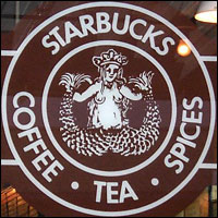
What exactly is that on the Starbucks logo? It looks like some fantasy femme we ought to be lusting after, but it is unclear what sort. Many people mistakenly believe that the Starbucks chick is a mermaid. She is not a mermaid. She is a siren. Early versions of her had two visible tails, rather than a mermaid’s single tail.
Early versions of the Starbucks logo also featured two visible nipples. The logo was redone to put the siren’s hair demurely over her breasts. Later the logo was redone again to eradicate the siren’s navel.
Given that the siren was a mythical creature who led sailors to a watery grave with the lure of her magical song, she seems like an odd choice for a logo. Maybe the idea was that Starbucks customers would become good harpooners like Queequeg through the consumption of magical caffeine. Or perhaps something more sinister. One of those.
